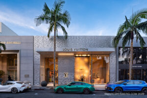
Skeptical at the Door with my M11 in Hand
On July 20, in the building’s first summer, I walked up to LACMA’s new Geffen Galleries with two photographer friends, and I will admit I was a little skeptical. $26 for a non resident ticket is not nothing, and the new building had spent years as the most argued about piece of architecture in Los Angeles. By the time I left, it had become one of my favorite museums I have been in, in a long time, anywhere in the United States. Every image here was made with my Leica M11 and the Voigtländer Nokton 28mm f1.5 Vintage II. I brought the 28 because I knew I would be photographing a lot of architecture, and honestly, it is my favorite lens in my lineup.
The Architect
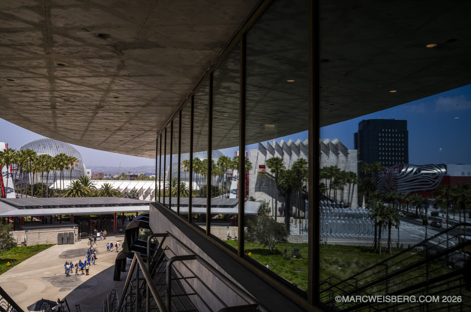
The building is the David Geffen Galleries, the new home for LACMA’s permanent collection, designed by the Swiss architect Peter Zumthor. Zumthor is a Pritzker Prize winner, best known for the thermal baths at Vals and a small number of obsessively crafted buildings in Europe. This is his first building in the United States. SOM served as architect of record and structural engineer. It opened to members on April 19, 2026, and to the public on May 4.
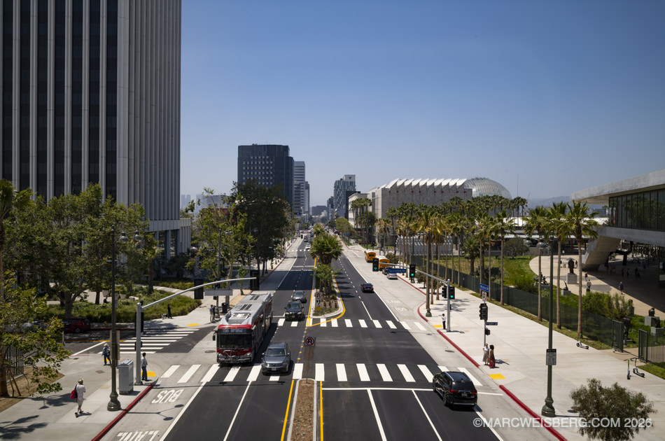
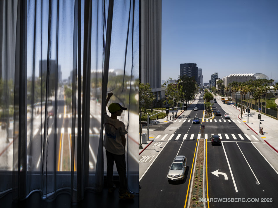
It is one continuous level of galleries, 110,000 square feet, lifted 30 feet in the air on seven concrete supports and stretched roughly 900 feet across the campus and right over Wilshire Boulevard. Underneath, 40 base isolators let the entire structure shift up to five feet in any direction in an earthquake. The reported cost was $724 million.
Austere, in the Best Way
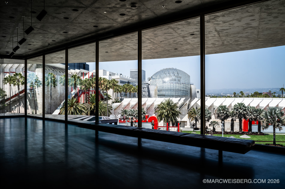
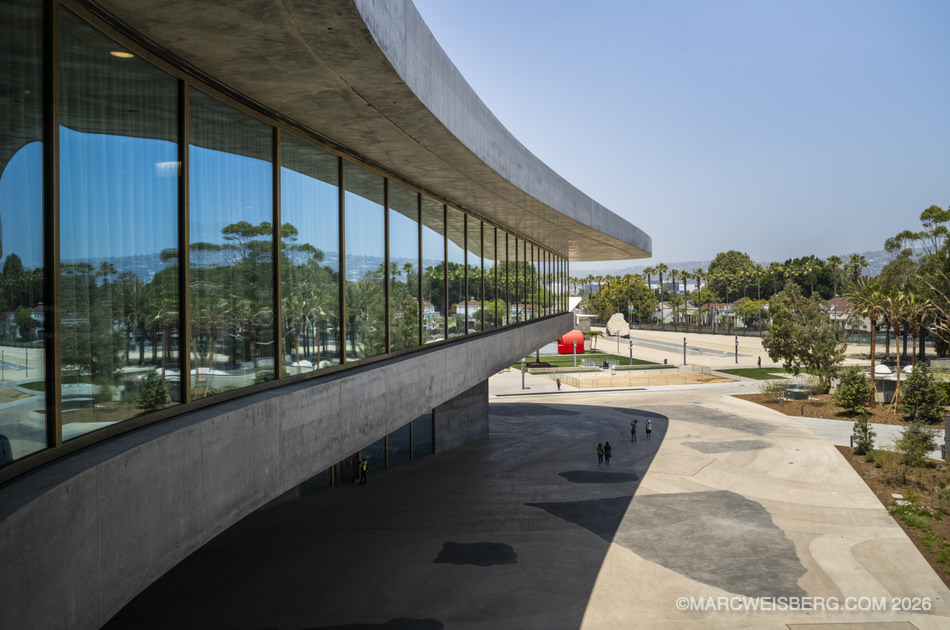
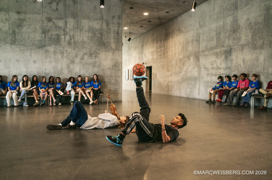
What blew me away was how austere it is. This is brutalism in the truest sense: raw concrete for the floors, the walls, and the ceilings, poured in more than 100 separate pours. According to the general contractor, there is no added color in it. The gray was chosen from many samples, and the seams and form lines were left showing on purpose, every one of them drawn and placed by the architects. As SOM’s structural partner Eric Long put it, “it’s just concrete, brass, and glass. But what’s behind it is beautifully complex.”
Even the floor tells a story. It is black concrete terrazzo with tiny white shells set into it, a reminder that this ground was once a seabed.
The Light and The Passageways
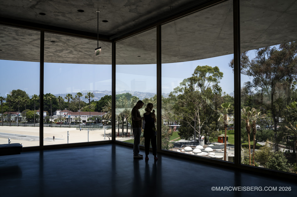
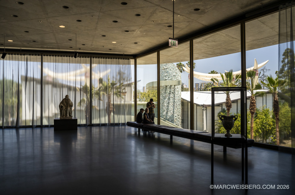
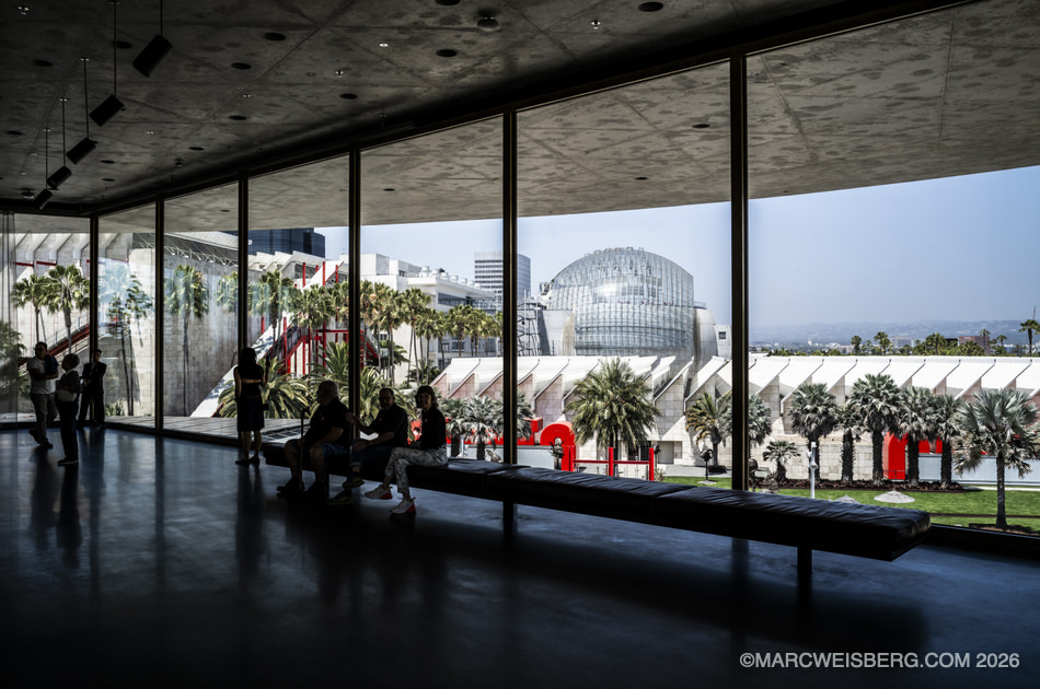
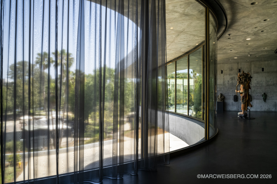
For a building made almost entirely of concrete, the light inside is beautiful. The outer galleries are wrapped in floor to ceiling glass, so the clear Los Angeles sun comes in from the sides and the city sits right there behind the art. Move toward the middle and you step into darker, enclosed rooms built for light sensitive work, their walls washed in mineral glazes of dusky red, deep blue, and black that tint the concrete without covering it. The building changes with the time of day and the season, so no two visits look the same.
The passageways between the galleries are half the experience. There is no front or back and no set route. You wander from bright to dark and back again, and every turn opens onto something new. LA Times critic Leah Ollman wrote that getting lost here is “inevitable, intentional” and “one of the best things about the place.” I agree.
 [
Everything, Side by Side
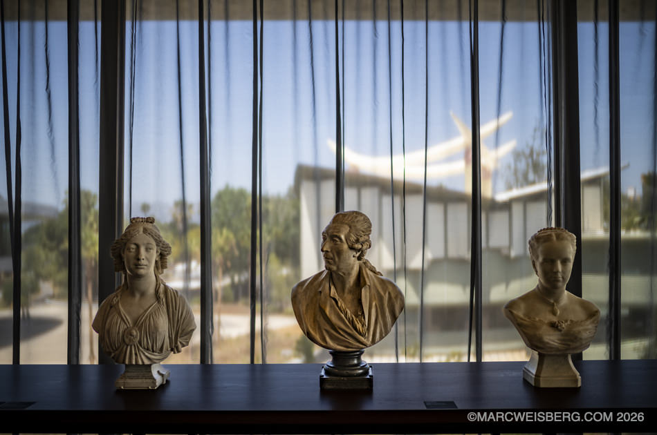
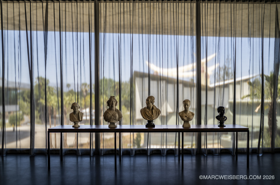
What impressed me on the art side was not one collection. It was that nearly every kind of art is here: photography, modern art, sculpture, Impressionist painting, pottery, six thousand years of it. And none of it is sorted the old way, by department, country, or century.
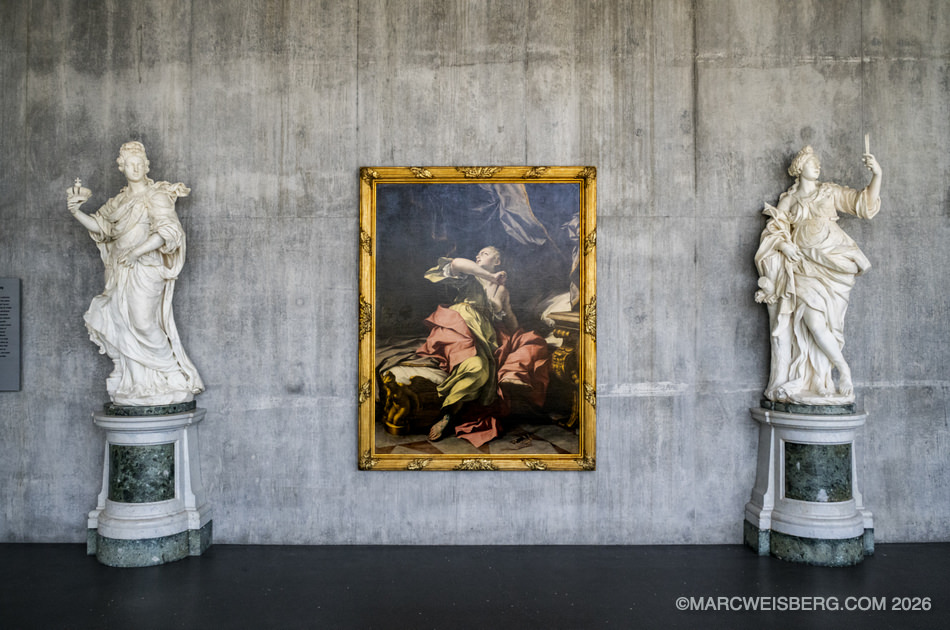
Instead, LACMA’s curators built the opening installation around four bodies of water, the Atlantic, Pacific, and Indian Oceans and the Mediterranean Sea, the routes along which objects, ideas, and people have moved for centuries. The idea came from the museum’s junior curators. In practice it means a 17th century Dutch painting can sit near 20th century photography, and African textiles near American quilts. Lauren Halsey’s new sphinx stands among Egyptian antiquities.
The moment it clicked for me, I was standing in front of a Magritte hung right beside an Impressionist painting. A Surrealist who spent his career making you doubt what you see, next to a painter who spent his career trying to capture exactly what he saw. Side by side, each one made the other look new.
The Art Newspaper put it better than I can. The old museum model ranks painting, European painting above all, over everything else. This building, its critic wrote, does not simply flatten those hierarchies: “it inverts them. This is a museum made for things.” The LA Times described the art as “freed from its departmental silos and put into conversation across genre lines, place and time.”
No Barriers Between You and the Art
The other thing I loved: there were almost no barriers around the art. No ropes, no stanchions. You can get very close to a piece as long as you do not touch it, and the guards in the galleries were completely low key about it. The labels are kept short on purpose, too. Museum director Michael Govan’s reasoning is that more time reading means less time looking. The whole place is built for looking.
It was Definitely Worth the Ticket
Not everyone loves it. Christopher Knight, the Pulitzer winning former LA Times art critic, argued against the design for years, and some critics still find all that gray relentless. On paper, I understand the argument. In person, it is a visually stunning space, and I cannot say enough good things about it. The $26 was a bargain. ●
More Leica Stories: Five Months Short of 100 Years and Why Leica
Concrete and Light on Wilshire ●
Shot on a Leica
Click any image to enlarge